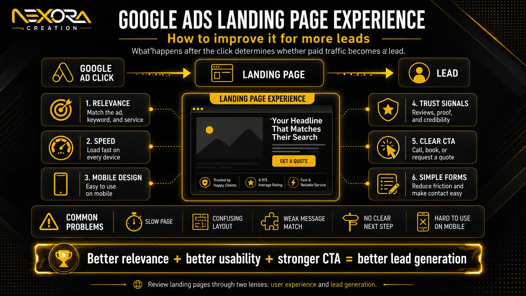
Google Ads landing page experience describes what happens after someone clicks your ad and arrives on your website.
The advertisement may earn the click, but the landing page must convince the visitor that they have reached the right place.
If the page is slow, difficult to use, unrelated to the advertisement, vague about the offer, or missing a clear next step, the visitor may leave without calling, booking, purchasing, or submitting a form.
This creates a common paid advertising problem: the campaign generates traffic, but the business does not generate enough qualified leads from that traffic.
A strong landing page experience helps visitors quickly understand:
- What the business offers
- How the offer matches their search
- Why they should trust the business
- What action they should take next
- What will happen after they take that action
In our experience reviewing landing pages at Nexora Creation, weak performance is rarely caused by one isolated design issue. It is usually the result of several small gaps between the keyword, advertisement, page content, mobile experience, offer, trust signals, form and follow-up process.
This guide explains what Google Ads landing page experience means, how it relates to Quality Score, why it may be rated Below Average, and how to improve it through stronger relevance, useful content, faster performance, mobile usability, transparency and conversion-focused design.
What Is Google Ads Landing Page Experience?
Google Ads landing page experience refers to how relevant, useful and easy to use a landing page is for someone who clicks an advertisement.
It is not simply a measurement of how attractive the page looks.
A visually polished landing page can still provide a poor experience when it:
- Does not match the keyword or advertisement
- Makes the service or offer difficult to understand
- Loads slowly on mobile devices
- Contains generic or insufficient content
- Hides important business information
- Uses confusing navigation
- Makes the form difficult to complete
- Includes broken buttons or page elements
- Creates uncertainty about what happens next
A good landing page should make the visitor feel that the page was created to answer their specific search.
For example, someone searching for “emergency roof repair” should arrive on a page that clearly explains emergency roof repair, availability, service coverage, response expectations and the next step.
Sending that visitor to a general homepage with a vague “Professional Roofing Solutions” headline creates extra work for them. They must search the page to confirm whether the business actually offers emergency repairs.
The stronger experience confirms the answer immediately.
The term “AdWords landing page experience” may still appear in older discussions and searches. AdWords was the former name of Google Ads, but the underlying principle remains the same: the page reached after the click should be closely connected to the user’s search and the promise made in the advertisement.
Why Does Landing Page Experience Matter?
Landing page experience matters because paid traffic has commercial intent and a direct cost.
Every irrelevant, confusing or difficult page experience can reduce the value of the click.
A weak landing page may contribute to:
- Fewer enquiries or sales
- Lower conversion rates
- Higher cost per qualified lead
- Poorer lead quality
- More abandoned forms
- Fewer phone calls
- Reduced trust
- Wasted advertising spend
Consider an advertisement that promises “same-day AC repair.”
If the landing page does not mention same-day availability, the visitor may question whether the offer is genuine. Even when the business provides that service, the page has failed to confirm the advertisement’s promise.
That uncertainty creates friction.
A relevant landing page reduces friction by maintaining a clear journey:
Search query → advertisement → landing page → action
The page should not force the visitor to reinterpret the offer at each stage.
From a business perspective, this means landing page improvement should not be treated only as a Google Ads technical exercise. It is also a conversion-rate and lead-generation exercise.
Google Ads can attract the right person, but the landing page must help that person understand, trust and act.
How Is Landing Page Experience Connected to Quality Score?
Landing page experience is one of the diagnostic components used in Google Ads Quality Score.
The three Quality Score components are generally presented as:
- Expected click-through rate
- Ad relevance
- Landing page experience
Quality Score is reported at keyword level on a scale from 1 to 10. It is intended to help advertisers compare the quality of their ads and landing pages with other advertisers targeting the same keyword.
However, Quality Score should not be treated as the campaign’s main business result.
It is a diagnostic indicator, not a replacement for metrics such as:
- Conversion rate
- Cost per lead
- Qualified lead volume
- Revenue
- Return on ad spend
- Customer acquisition cost
A landing page can look professional and still receive a weak experience rating if it does not closely support the keyword and advertisement.
Similarly, improving page design alone does not guarantee a higher Quality Score, cheaper clicks or more conversions. The keyword, advertisement and destination must be reviewed together.
At Nexora Creation, we find it more useful to treat the landing page experience rating as a signal that deserves investigation rather than as a score that should be manipulated in isolation.
The correct question is not:
“How can we force this metric to increase?”
The better question is:
“What does the visitor expect after searching this keyword, and does the page satisfy that expectation clearly?”
Google Ads Quality Score and landing page experience
What Does Below Average Landing Page Experience Mean?
A Below Average landing page experience means Google considers the page experience less satisfactory than competing advertiser experiences for that keyword.
It does not necessarily mean the website is completely unusable or poorly designed.
The page may be functional but still receive a Below Average assessment because it is not specific, useful or closely matched enough for the keyword being evaluated.
Common reasons may include:
- Weak keyword-to-page relevance
- Generic page headings
- Thin or repetitive content
- Slow mobile performance
- Difficult navigation
- An unclear offer
- Limited transparency
- Intrusive pop-ups
- Poor form usability
- Missing trust signals
- Content that does not satisfy the search intent
- A mismatch between the advertisement and destination
For example, a general website development page may be a legitimate business page. However, it may not be the strongest destination for a keyword such as “Google Ads landing page design.”
That searcher expects information about paid-traffic landing pages, message match, conversion structure, forms, tracking and campaign-focused design.
A broad website-development page may not satisfy that specific expectation, even though it is related to the topic.
When landing page experience is Below Average, avoid making random changes across the entire website.
Review the affected keyword, advertisement and landing page together:
- What exactly did the user search?
- What did the advertisement promise?
- Does the landing-page headline confirm that promise?
- Does the page provide useful information about the searched service?
- Is the next step clear?
- Does the page work properly on mobile?
- Can visitors trust the business?
- Are there unnecessary distractions?
This review usually reveals more than concentrating on a single design element.
How to Improve Google Ads Landing Page Experience
Improving landing page experience requires alignment between user intent, content, usability and the conversion journey.
The following areas should be reviewed together.
1. Improve Keyword, Ad and Landing Page Message Match
Message match means the landing page continues the same promise introduced by the search keyword and advertisement.
A strong sequence may look like this:
Keyword: Emergency roof repair
Ad headline: Get Emergency Roof Repair
Landing-page headline: Emergency Roof Repair When You Need Urgent Help
Primary CTA: Request Emergency Roof Repair
A weaker sequence may look like this:
Keyword: Emergency roof repair
Ad headline: Get Emergency Roof Repair
Landing-page headline: Complete Roofing Solutions
Primary CTA: Learn More
The second version is related to roofing, but it makes the visitor work harder to confirm whether urgent repair is available.
The page should align with:
- The searched service
- The problem or need
- The advertisement’s promise
- The location or coverage, where relevant
- The offer
- The level of urgency
- The intended next action
This does not mean repeating the keyword unnaturally throughout the page.
It means making the topic unmistakably clear.
Ask these questions:
- Does the headline reflect the advertisement?
- Is the advertised service visible above the fold?
- Is the offer described consistently?
- Does the CTA match the visitor’s likely intention?
- Are important conditions explained?
- Can the visitor confirm they are in the right place within a few seconds?
In our landing-page reviews, one of the most common problems is using a broad service page for several very different advertising intents.
A page designed for general website development may not be the ideal destination for searches related specifically to ecommerce development, landing-page design or website redesign.
When the search intent is materially different, a more focused landing page usually creates a clearer experience.
conversion-focused landing page development
2. Provide Useful, Original and Intent-Focused Content
A landing page should give visitors enough information to make the next decision.
Thin pages often rely on a headline, a few generic claims and a form. This may not be sufficient for visitors who need to understand the service, process, conditions or business before contacting it.
Useful landing-page content may explain:
- What the service includes
- Who the service is designed for
- What problem it solves
- How the process works
- What makes the offer different
- Which areas or customers are served
- What happens after an enquiry
- Common questions or concerns
- Relevant limitations or conditions
The content should be original to the business and the specific offer.
Avoid vague statements such as:
“We provide high-quality solutions tailored to your needs.”
This statement could appear on almost any website.
A stronger version would be:
“Need urgent AC repair? Request an inspection and speak with a service team about the fault, availability and next steps.”
The second version identifies the problem, service and action.
Useful content does not need to be unnecessarily long. It needs to answer the questions preventing the visitor from taking action.
3. Write Clear and Specific Landing-Page Copy
Paid visitors often scan rather than read every paragraph.
The page should therefore make its most important information easy to find.
Use:
- A clear service-focused headline
- A short supporting explanation
- Benefit-led subheadings
- Short paragraphs
- Specific bullet points
- Visible calls to action
- Plain language
- Service-specific examples
- Clear next-step information
Your copy should answer:
- What do you offer?
- Who is it for?
- What problem does it solve?
- Why should the visitor trust you?
- What should the visitor do next?
- What happens after they act?
Avoid writing only from the company’s perspective.
Instead of opening with the company history, start with the visitor’s need and the relevant solution.
Company information can support trust later on the page, but the visitor should not have to read several paragraphs before understanding the offer.
Do not try to sound clever at the expense of clarity.
For a landing page, clarity usually creates more value than complicated language.
4. Improve Page Speed and Technical Performance
A landing page cannot communicate its value if users leave before it becomes usable.
Slow loading is particularly damaging for mobile visitors, who may be using weaker connections or searching while they are away from a desktop computer.
Common causes of poor landing-page performance include:
- Oversized or uncompressed images
- Heavy background videos
- Unnecessary scripts
- Excessive tracking tags
- Bloated themes or page builders
- Poor hosting
- Too many plugins
- Complex animations
- Missing caching
- Broken third-party elements
Practical improvements may include:
- Compressing and correctly sizing images
- Using modern image formats where appropriate
- Removing unused scripts and plugins
- Limiting heavy animations
- Delaying non-essential third-party code
- Improving hosting and caching
- Testing the page on real mobile devices
- Checking that the main content and CTA appear quickly
Do not judge performance only by how the page loads on your own computer.
A page may appear fast for the business owner because it has already been cached or is being viewed on a fast connection.
Test the actual destination across multiple devices and network conditions.
The goal is not to chase a perfect performance score while damaging the design or functionality. The goal is to make the page reliably fast and usable for real visitors.
5. Prioritize the Mobile Landing-Page Experience
Many paid-search visitors reach landing pages through mobile devices.
For urgent and local services, mobile users may be ready to call immediately.
A strong mobile landing page should provide:
- A clear headline
- Readable text
- Tap-friendly buttons
- A visible click-to-call option
- A short, usable form
- Comfortable spacing
- A simple layout
- Fast loading
- Limited distractions
- No intrusive or difficult-to-close pop-ups
The primary CTA should not disappear below several screens of introductory content.
Where appropriate, a sticky call or enquiry button can help visitors act without repeatedly scrolling.
The ideal mobile journey is simple:
- Understand the service
- Confirm relevance
- Find evidence of trust
- Tap the CTA
- Call, book or submit the form
A desktop layout that has merely been reduced to fit a smaller screen is not necessarily a good mobile experience.
Review the order, spacing, form fields, button sizes and visible information specifically for mobile visitors.
Google Ads also provides landing-page reporting that can help advertisers identify destinations that may need better mobile experiences.
6. Add Relevant Trust Signals
Visitors may understand the service and still hesitate because they do not know whether the business is credible.
Trust signals help reduce that uncertainty.
Depending on the business, useful trust signals may include:
- Customer reviews and ratings
- Testimonials
- Case studies
- Licences or certifications
- Service guarantees
- Years of relevant experience
- Team or business photographs
- Clear contact information
- Portfolio examples
- Recognised client or partner logos
- Before-and-after examples where appropriate
- Privacy and security information
Trust signals should support specific claims rather than exist only as decoration.
For example, a testimonial placed near a form can help answer the visitor’s concern about what the service experience will be like.
A case study can demonstrate how the business approached a similar problem.
A licence or certification may matter significantly in regulated or technical industries.
Important trust information should not be hidden exclusively at the bottom of the page.
Consider placing it:
- Near the hero section
- Beside an important service claim
- Close to the form
- Before the final CTA
- Near pricing or guarantee information
The right trust proof depends on the visitor’s risk and the type of decision they are making.
7. Use a Clear and Consistent Call to Action
The call to action should tell visitors exactly what they can do next.
Generic CTAs such as “Submit,” “Click Here” or “Learn More” may not communicate the outcome clearly.
More specific examples include:
- Get a Free Quote
- Request an Inspection
- Book a Consultation
- Call for Same-Day Help
- Schedule an Appointment
- Speak With a Specialist
- Get My Estimate
The CTA should reflect the user’s intent.
For an urgent service, “Call for Emergency Help” may be more suitable than “Book a Consultation.”
For a complex B2B service, “Request a Strategy Consultation” may be more appropriate than “Buy Now.”
Choose one primary conversion goal for the page.
The CTA may be repeated in the hero, middle and final sections, but the wording and intended action should remain consistent.
Too many competing options can create hesitation.
A secondary action may still be helpful for visitors who are not ready to convert, but it should not visually compete with the primary goal.
8. Simplify the Form Experience
Every unnecessary form field increases the effort required to enquire.
For many service landing pages, the initial form may only need:
- Name
- Phone number or email
- Service needed
- Location or ZIP code, where necessary
- A short message
Additional information can often be collected during the follow-up conversation.
Avoid requesting sensitive, detailed or time-consuming information before explaining why it is required.
The form should also be tested for:
- Mobile usability
- Clear labels
- Helpful error messages
- Correct input types
- A visible submit button
- A clear confirmation message
- Successful lead delivery
- Appropriate spam protection
- Fast loading
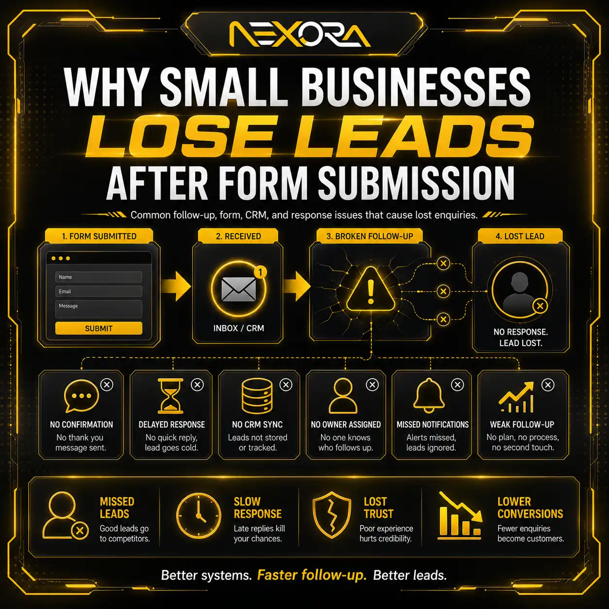
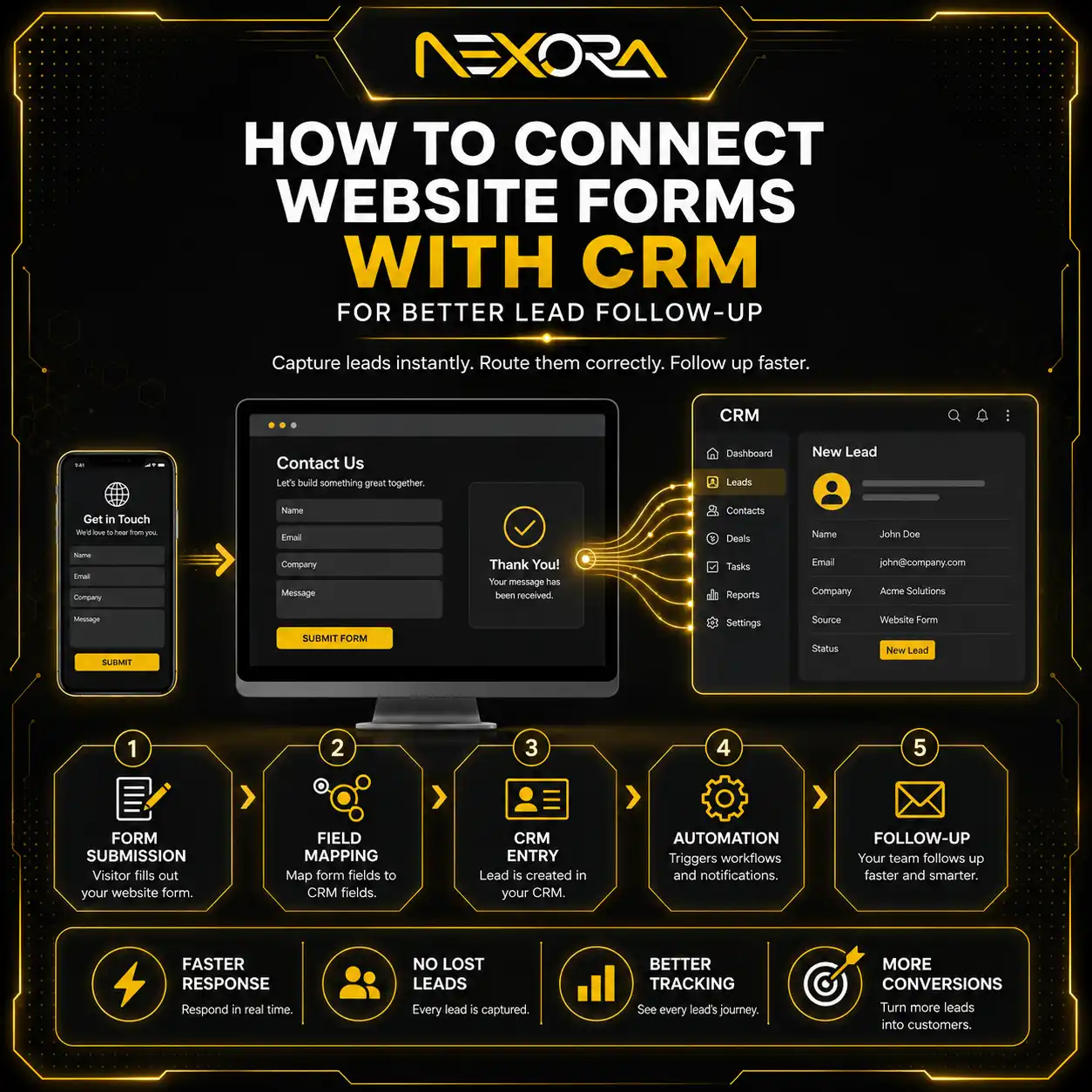
A visually attractive form is not useful if submissions do not reach the correct inbox, CRM or booking system.
At Nexora Creation, we consider form delivery part of the landing-page audit rather than assuming that a successful on-screen message means the lead was captured correctly.
Test the complete journey using real submissions.
9. Use Navigation Carefully
Navigation can either support confidence or distract visitors from the campaign goal.
A highly focused landing page may work well with:
- A logo
- A phone number
- A primary CTA
- A few anchor links within the page
- Limited supporting navigation
However, removing every navigation option is not always the best choice.
Visitors considering legal, healthcare, financial, technical or high-value B2B services may want to review:
- About information
- Credentials
- Case studies
- Reviews
- Privacy information
- Other service details
The right approach depends on the amount of trust and research required before conversion.
Do not trap visitors on the page by disabling normal browser behaviour or making it difficult to leave.
At the same time, avoid presenting a large menu containing many unrelated exits.
Keep the conversion path focused while allowing access to information that genuinely supports the decision.
10. Improve Transparency and Page Functionality
A landing page should clearly explain the offer and work as expected.
Be transparent about:
- What the service includes
- Whether an estimate or consultation is free
- Which areas are served
- How pricing is determined
- How quickly the business normally responds
- What happens after form submission
- Any relevant conditions or limitations
- How user information is handled
Avoid making claims that are broader than the service actually provided.
If pricing varies, explain the factors that affect it rather than using misleading fixed-price language.
For example:
“Pricing depends on the service, urgency, location and project requirements. We provide a clear quote before work begins.”
Before sending paid traffic, test:
- Page loading
- Forms
- Phone links
- Booking buttons
- Internal links
- Confirmation messages
- Browser compatibility
- Mobile layout
- Redirects
- Tracking
- Contact information
Google’s destination policies require advertising destinations to be functional, useful, accessible and easy to navigate. Difficult navigation, broken destinations, misleading experiences and pages that do not work correctly can create both user-experience and advertising-policy problems.
11. Measure What Happens After the Click
Clicks and impressions do not show whether a landing page is producing business results.
Track meaningful actions such as:
- Form submissions
- Phone calls
- Click-to-call actions
- Appointment bookings
- Quote requests
- Live-chat enquiries
- Email clicks
- Qualified leads
- Cost per lead
- Lead-to-customer rate
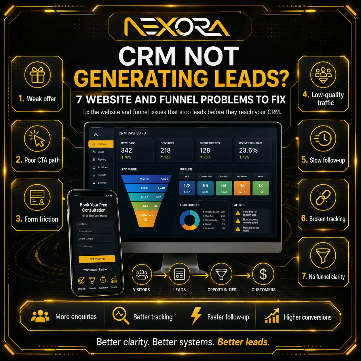
Measurement helps identify where the journey is breaking.
For example:
- High clicks with very little engagement may indicate weak message match.
- Strong page engagement with few conversions may indicate an unclear offer or CTA.
- Form starts without submissions may indicate form friction.
- Leads without sales may indicate poor lead quality or slow follow-up.
- Reported conversions without real enquiries may indicate broken tracking.
Do not optimize the landing page using assumptions alone.
Combine analytics, conversion tracking, call data, form data and lead-quality feedback.
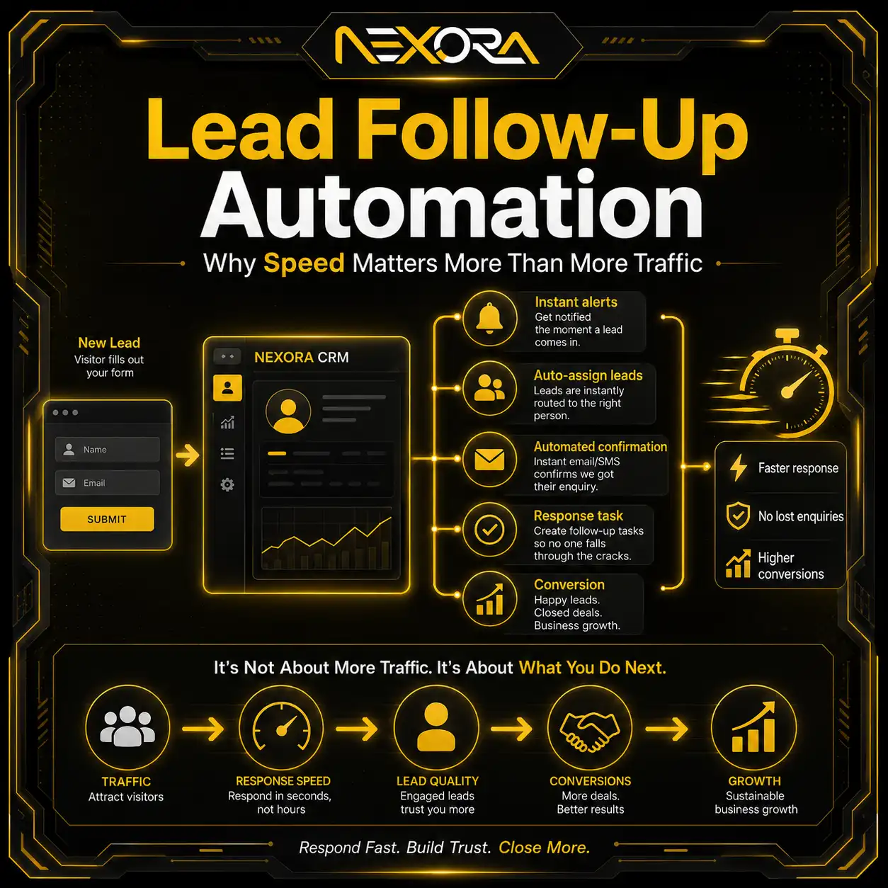
After a lead converts, make sure it reaches the responsible person or system quickly. Slow or inconsistent follow-up can reduce the commercial value of an otherwise effective landing page.
CRM lead capture and follow-up automation
12-Point Google Ads Landing Page Experience Audit
Use the following checklist to review the full journey from search to lead.
1. Review the search intent
What is the person actually trying to find, compare or accomplish?
2. Review the keyword
Does the keyword represent the service and intent covered by the page?
3. Review the advertisement
What promise, offer or expectation does the advertisement create?
4. Check the landing-page headline
Does the headline immediately confirm the advertisement and keyword topic?
5. Review content usefulness
Does the page answer the visitor’s main questions with specific and original information?
6. Test mobile usability
Can visitors read, navigate, call and submit the form easily on a phone?
7. Test loading and functionality
Does the page load reliably, and do all important elements work?
8. Review the offer
Is the service, process, promotion or next step clearly explained?
9. Check trust proof
Are relevant reviews, testimonials, credentials or examples visible?
10. Review the CTA and form
Is there one clear primary action, and is the form easy to complete?
11. Verify conversion tracking
Are calls, forms, bookings and other valuable actions being measured correctly?
12. Test lead delivery and follow-up
Does the enquiry reach the correct person or system, and can it be handled promptly?
A landing-page audit should not end after checking the design.
The entire path—from keyword and advertisement to form submission and lead delivery—should be tested.
Common Google Ads Landing Page Experience Mistakes
The most common mistakes include:
Sending every advertisement to the homepage
A homepage often covers several services and audiences, making it less specific to the advertisement.
Using a vague headline
A general headline may not confirm the exact service or offer the visitor searched for.
Weak keyword-to-page message match
The page may be broadly related but not sufficiently aligned with the specific search intent.
Thin or generic content
The page may provide too little useful information for the visitor to make a decision.
Slow mobile performance
Large media files, scripts and bloated layouts may delay the page and CTA.
Hiding the primary CTA
Visitors should not have to search for a way to call, book or enquire.
Using a long or difficult form
Too many required fields may discourage potential leads.
Missing trust signals
Strong claims without reviews, examples or business information can create hesitation.
Adding too many distractions
Multiple menus, pop-ups, sliders and competing CTAs can weaken the conversion path.
Failing to test forms and tracking
A page may appear functional while enquiries are not being recorded or delivered correctly.
Each mistake adds friction.
The goal is not to make the landing page aggressive or overly simplified. The goal is to remove unnecessary uncertainty while giving visitors enough information to make a confident decision.
How Long Does It Take for Landing Page Experience to Improve?
There is no universal timeframe for a landing page experience assessment to change.
The timing can depend on factors such as:
- The amount of relevant keyword and ad traffic
- How frequently the system collects enough data
- The significance of the page changes
- The relationship between the keyword, ad and destination
- Campaign activity
- Historical performance
Do not expect every design or content change to create an immediate visible update.
After making meaningful improvements:
- Confirm that the updated page is live.
- Test it across mobile and desktop devices.
- Verify that Google AdsBot can access the destination.
- Confirm that the advertisement still points to the correct URL.
- Allow the campaign to collect sufficient new data.
- Review conversion and lead-quality metrics alongside Quality Score indicators.
Avoid repeatedly changing the page every few days without collecting enough evidence.
A structured testing cycle is more useful than reacting to every short-term fluctuation.
Can a Homepage Provide a Good Landing Page Experience?
A homepage can provide a good experience when it closely matches the advertisement and search intent.
However, many homepages are designed to introduce an entire business rather than solve one specific paid-search need.
They may include:
- Several services
- Multiple audiences
- Company news
- Broad brand messaging
- Numerous navigation options
- Several competing CTAs
For a highly specific advertising campaign, a dedicated landing page or focused service page often creates a clearer message.
A homepage may still be suitable for branded searches or broad company-level campaigns.
The decision should be based on intent, not on a fixed rule that every advertisement must use a separate landing page.
Google Ads landing pages for local service businesses
A Practical Nexora Creation Perspective
When reviewing paid-traffic landing pages, we use two connected lenses:
The visitor experience
Can the person quickly understand the offer, confirm relevance, trust the business and complete the next step?
The business outcome
Can the page capture the correct action, measure it accurately and deliver the enquiry to the team?
A page may perform well in one area and poorly in the other.
For example:
- A polished page may attract attention but use a weak CTA.
- A short form may generate leads but fail to record the campaign source.
- A relevant advertisement may lead to a generic service page.
- A strong desktop page may be difficult to use on mobile.
- A working form may send enquiries to an inbox that is not monitored promptly.
This is why we do not evaluate landing pages only by appearance or a single automated score.
We review the full relationship between:
- Search intent
- Keyword targeting
- Advertisement promise
- Page content
- Mobile usability
- Trust
- Conversion action
- Tracking
- Lead delivery
The strongest landing pages align these elements around one clear user need.
How Nexora Creation Can Help
If your Google Ads are receiving clicks but not enough calls, bookings or qualified enquiries, the landing page may need a deeper review.
Nexora Creation helps businesses improve paid-traffic landing pages through:
- Keyword-to-page message-match reviews
- Conversion-focused landing-page design
- Clearer page structure and copy
- Mobile usability improvements
- CTA and form optimization
- Trust-signal placement
- Conversion-tracking support
- Lead-capture integration
Our approach focuses on both sides of the journey: providing a useful experience for the visitor and creating a measurable path to enquiry for the business.
conversion-focused website and landing-page services
Conclusion
Google Ads landing page experience is not about adding a keyword several times or making a page visually impressive.
It is about fulfilling the expectation created by the search and advertisement.
A strong landing page should:
- Match the keyword and advertisement
- Provide useful and specific information
- Load and function properly
- Work well on mobile devices
- Make the offer transparent
- Demonstrate trust
- Present one clear next action
- Track meaningful conversions
When performance is weak, review the complete journey rather than adjusting only the advertisement or landing-page design.
The keyword attracts the intent. The advertisement earns the click. The landing page must turn that click into understanding, trust and action.
Frequently Asked Questions
What is landing page experience in Google Ads?
Landing page experience describes how relevant, useful and easy to use a page is for someone who clicks a Google advertisement. It considers more than visual design and includes factors such as relevance, content usefulness, navigation, transparency, functionality and mobile usability.
What does Below Average landing page experience mean?
Below Average means the page experience is considered weaker than competing advertiser experiences for that keyword. Possible causes include weak message match, generic content, poor mobile usability, slow performance, difficult navigation or an unclear offer.
How do I improve Google Ads landing page experience?
Improve the alignment between the keyword, advertisement and page. Make the content specific and useful, improve mobile performance, simplify navigation, add relevant trust signals, use a clear CTA, shorten the form and verify that the page and tracking work correctly.
Does landing page experience affect Quality Score?
Yes. Landing page experience is one of the diagnostic components of Quality Score, together with expected click-through rate and ad relevance. Quality Score should be used as a diagnostic indicator rather than as the campaign’s only performance target.
Should the landing-page headline match the advertisement?
The wording does not always need to be identical, but the headline should clearly continue the same topic, service, offer and expectation introduced by the advertisement.
Can I use my homepage as a Google Ads landing page?
You can use a homepage when it closely matches the search intent and advertisement. For specific campaigns, a dedicated landing page or focused service page may provide a clearer and more relevant experience.
How long does it take for landing page experience to update?
There is no fixed timeframe. Google Ads may need sufficient new traffic and data after meaningful page changes. Continue monitoring conversions, lead quality and campaign performance rather than relying only on the visible landing-page rating.