
If your website is not converting leads, the problem often starts above the fold.
Above the fold is the first visible section users see before they scroll.
This section decides whether visitors stay, trust you, understand your offer, and take action.
A weak above-the-fold section can make visitors leave even if the rest of your website is good.
Common above-the-fold issues include:
- Weak headline
- Unclear offer
- Hidden CTA
- No trust proof
- Poor mobile layout
- Slow loading hero section
- Confusing navigation
- Generic stock image
- Too much text
- No service clarity
- No location clarity
- No urgency
- No contact option
- No value proposition
- Form not visible
- CTA button not specific
- Page does not match search intent
As an SEO expert and website developer, I always review the first screen before changing the full website.
Why?
Because most visitors decide quickly whether the page feels relevant.
If the first section does not answer the visitor’s question, they may never scroll down to see your services, reviews, pricing, FAQs, or contact form.
At Nexora Creation, I treat above-the-fold design as a lead-generation system. The goal is not only to look professional. The goal is to immediately explain the offer, build trust, and guide visitors toward the next step.
In this guide, I will show you the above-the-fold issues that stop websites from converting leads and how to fix them.
Planning a new site? See how we approach custom WordPress websites for service businesses.
What does above the fold mean on a website?
Above the fold means the part of a webpage visitors see before scrolling.
On a desktop, this usually includes:
- Header
- Navigation
- Hero headline
- Hero paragraph
- CTA buttons
- Trust badges
- Main visual
- Phone number or contact option
- Sometimes a short form
On mobile, above the fold is smaller.
It may only show:
- Logo
- Menu icon
- Headline
- Short paragraph
- One CTA button
- Maybe a phone button
This is why mobile above-the-fold design matters so much.
A desktop hero section may look good, but the mobile version may hide the CTA, cut the headline, or push trust proof too far down.
If users cannot understand your page quickly, conversions drop.
Why does above-the-fold content affect lead conversion?
Above-the-fold content affects lead conversion because it creates the first impression.
Visitors immediately ask:
- Am I in the right place?
- Does this business solve my problem?
- Can I trust this company?
- What should I do next?
- Is this worth my time?
- Do they serve my area?
- Can I contact them easily?
- What makes them different?
If your first screen does not answer these questions, the visitor may leave.
This is especially important for:
- Service pages
- Google Ads landing pages
- Local business websites
- Homepage hero sections
- Emergency service pages
- Quote request pages
- Booking pages
- High-intent SEO landing pages
Above the fold should not only be beautiful.
It should be clear, relevant, trustworthy, and action-focused.
What are the signs your above-the-fold section is not converting?
Your above-the-fold section may be hurting conversions if you see:
- High bounce rate
- Low engagement
- Low form submissions
- Low phone clicks
- Low CTA clicks
- Visitors not scrolling
- Paid traffic not converting
- Mobile users leaving quickly
- Heatmaps showing no CTA clicks
- Contact form views but no submissions
- Service-page traffic without leads
- Users clicking navigation instead of CTA
- Visitors spending little time on page
- Good rankings but poor enquiries
You may also notice that people ask basic questions on calls that your website should have answered.
That means your page is not communicating clearly enough.

Is your headline clear enough?
The headline is the most important text above the fold.
A weak headline creates confusion.
Weak headlines include:
- Welcome to Our Website
- We Build Digital Solutions
- Grow Your Business Online
- Professional Services for Everyone
- Your Success Starts Here
- Quality You Can Trust
These sound nice but do not explain enough.
A strong headline should explain:
- What you do
- Who you help
- What outcome you create
- What problem you solve
Better headline examples:
- Website Development Services Built to Generate Leads
- SEO Services That Turn Search Traffic Into Enquiries
- CRM Automation That Stops Leads From Getting Lost
- AI Chatbots That Capture Website Leads 24/7
- Local SEO Services That Help Small Businesses Get More Calls
The visitor should understand the offer in seconds.
If they have to guess, the headline is too vague.
Does your headline match the visitor’s intent?
A headline should match why the visitor came to the page.
If someone searches for “website development services,” the headline should clearly mention website development.
If someone searches for “SEO audit,” the headline should not say “Digital Growth Solutions.”
Search intent mismatch creates confusion.
Examples:
Weak match:
- Search query: SEO services
- Headline: Grow Your Business Online
Better match:
- Search query: SEO services
- Headline: SEO Services That Improve Rankings and Generate Leads
Weak match:
- Search query: CRM automation
- Headline: Smarter Business Systems
Better match:
- Search query: CRM automation
- Headline: CRM Automation Services That Improve Lead Follow-Up
Your above-the-fold section should confirm that the visitor landed on the right page.
Is your value proposition too generic?
A value proposition explains why someone should choose your business.
A generic value proposition does not create interest.
Weak value propositions include:
- We provide high-quality services.
- We are professional and reliable.
- We help businesses grow.
- We offer affordable solutions.
- We care about our clients.
These statements are too broad.
A strong value proposition should be specific.
It should explain:
- The problem
- The solution
- The outcome
- The audience
- The difference
Example:
“We help service businesses build fast, SEO-ready websites with clear service pages, strong CTAs, CRM-connected forms, and lead-focused user journeys.”
This is stronger because it explains exactly what the visitor gets.
Your above-the-fold section should make the benefit obvious.
Is your CTA visible above the fold?
If your CTA is not visible above the fold, visitors may not know what to do next.
A CTA should be easy to see.
Common CTA problems include:
- CTA hidden below the hero
- CTA only in navigation
- CTA button blends into design
- CTA appears only after scrolling
- CTA text is vague
- CTA is too small on mobile
- CTA looks like a secondary link
- Too many CTAs compete for attention
- CTA is not connected to the offer
A strong above-the-fold section should include at least one clear primary CTA.
Examples:
- Schedule a Consultation
- Request a Website Review
- Get an SEO Audit
- Request a Quote
- Book a Strategy Call
- Fix My Lead Flow
- Improve My Website Conversion
The CTA should be visible without forcing the user to search.
Is your CTA specific enough?
Generic CTA text can reduce clicks.
Weak CTA text includes:
- Submit
- Learn More
- Click Here
- Contact Us
- Get Started
These can work sometimes, but they often lack value.
Better CTA text tells users what they will get.
Examples:
- Request a Free Website Review
- Schedule an SEO Consultation
- Get a Lead Conversion Audit
- Request a CRM Automation Demo
- Add AI Chatbot Lead Capture
- Book a Strategy Call
The CTA should match the page.
For a website development page, use:
- Get a Website Review
For an SEO service page, use:
- Request an SEO Audit
For a CRM page, use:
- Fix My Lead Follow-Up
For an AI chatbot page, use:
- Capture More Website Leads
A specific CTA feels more useful.
Are there too many CTAs above the fold?
Too many CTAs can confuse users.
If the hero section has several buttons, links, popups, banners, and menu distractions, users may not know what action matters most.
Common examples:
- Book Now
- Learn More
- Download
- Watch Video
- View Services
- Contact Us
- Subscribe
- Chat Now
- Get Offer
- Read Blog
Too many choices can reduce action.
A strong hero section usually needs:
- One primary CTA
- One secondary CTA, if useful
Example:
Primary CTA:
- Schedule a Consultation
Secondary CTA:
- View Services
The primary CTA should be visually stronger.
The secondary CTA should support users who need more information.
Is your hero paragraph too long?
The hero paragraph should be short and clear.
Many websites lose visitors because the hero text is too long, vague, or hard to scan.
Weak hero paragraphs often include:
- Too many buzzwords
- Long sentences
- No clear outcome
- Too many services
- No audience focus
- No next step
- No service clarity
A strong hero paragraph should explain the offer in 1 to 3 short sentences.
Example:
“We help small businesses build SEO-ready websites that explain services clearly, improve trust, and turn visitors into enquiries through strong CTAs, fast pages, and CRM-connected lead forms.”
This gives users a quick reason to stay.
Above the fold is not the place for your full story.
It is the place for clarity.
Does your first screen show trust proof?
Visitors may not convert if the first screen gives them no reason to trust you.
Trust proof above the fold can include:
- Star rating
- Client logos
- Review snippet
- Years of experience
- Number of projects
- Certifications
- Local business badge
- Licensed and insured, if relevant
- Security or privacy note
- Case study result
- Portfolio preview
- Response time
- Google review count
Examples:
- Trusted by local service businesses
- 50+ websites built for lead generation
- 24-hour response time
- CRM-connected lead tracking
- Rated 5 stars by local clients
- SEO and website strategy under one team
Do not overload the hero with proof.
Add one or two trust signals that matter most.
Are you using a generic stock image?
A generic hero image can weaken trust.
Many websites use stock images that do not explain the service or build confidence.
Weak visuals include:
- Random business people shaking hands
- Generic laptop photo
- Abstract shapes only
- Overused stock office image
- Unrelated industry photo
- Image that slows the page
- Image that pushes CTA down
- Visual with no message
Better visuals include:
- Real team photo
- Service dashboard
- Website mockup
- Before-and-after example
- Process graphic
- Local project image
- CRM pipeline screenshot
- Lead flow diagram
- Relevant industry photo
- Clean branded illustration
The hero visual should support the message.
It should help users understand the offer faster.
Is your hero section too cluttered?
A cluttered hero section can reduce clarity.
Above the fold should not feel crowded.
Common clutter issues include:
- Too much text
- Too many buttons
- Too many icons
- Large background image
- Multiple offers
- Popups
- Announcement bars
- Animated elements
- Busy navigation
- Too many badges
- Too many colors
- Distracting sliders
A clean hero section should have:
- One clear headline
- One short paragraph
- One primary CTA
- One trust signal
- One useful visual
- Simple navigation
Clarity beats decoration.
If everything is important, nothing is important.
Is your navigation distracting users?
Navigation should help users, not distract them.
Above the fold, navigation should be simple and useful.
Common navigation problems include:
- Too many menu items
- Vague labels
- Important services hidden
- No contact button
- No phone number
- Confusing dropdowns
- Broken mobile menu
- Too many external links
- Blog links more visible than service links
- No clear path to services
A good service business navigation should include:
- Home
- Services
- About
- Portfolio or Case Studies
- Blog
- Contact
For conversion-focused pages, the header can be simpler.
For Google Ads landing pages, reduce navigation distractions.
The main goal should remain clear.
Is your phone number or contact option visible?
For service businesses, many users prefer calling instead of filling out a form.
If your phone number is hidden, you may lose leads.
Above the fold, consider showing:
- Click-to-call number
- Contact button
- Booking button
- Chatbot button
- Request quote button
- Emergency call button, if relevant
This is especially important for:
- HVAC
- Roofing
- Plumbing
- Medical clinics
- Legal services
- Home services
- Repair services
- Emergency services
- Local contractors
Mobile users should be able to call easily.
Do not make them search for contact information.
Does the page show who the service is for?
Visitors convert better when they recognize themselves in the page.
A vague website tries to speak to everyone.
A high-converting website speaks to a specific audience.
Above the fold, make it clear who you help.
Examples:
- SEO services for small businesses
- Website development for service-based businesses
- CRM automation for growing teams
- AI chatbot services for local service companies
- Landing pages for Google Ads campaigns
- Website design for contractors and local brands
Audience clarity improves relevance.
It helps users think:
“This is for my type of business.”
Does the page show what problem you solve?
A visitor is more likely to convert when the hero section speaks to their problem.
Above the fold, show the problem clearly.
Examples:
- Website visitors are not turning into leads
- Rankings are dropping
- Leads are getting lost after form submission
- Google Ads clicks are not converting
- Visitors leave before contacting you
- Calls are missed after business hours
- Service pages are unclear
- Website design looks outdated
Then connect the problem to the solution.
Example:
“Turn unclear service pages into lead-focused website experiences that help visitors understand your offer and contact you faster.”
Problem clarity creates urgency.
Is your offer clear above the fold?
Your offer should be easy to understand.
A visitor should know what they can get from you.
Weak offers include:
- Digital solutions
- Growth strategy
- Online success
- Business support
- Innovative services
Clear offers include:
- Website redesign
- SEO audit
- CRM automation setup
- AI chatbot setup
- Landing page development
- Local SEO service
- Service-page optimization
- Website conversion audit
A clear offer helps visitors decide faster.
If your offer is vague, they may leave to find a clearer competitor.
Is the form visible above the fold?
For some landing pages, showing a form above the fold can improve lead capture.
This is especially useful for:
- Quote request pages
- Booking pages
- Google Ads landing pages
- Emergency service pages
- Consultation pages
- Local service landing pages
However, not every page needs a full form above the fold.
Sometimes a CTA button works better if the visitor needs more trust first.
Good options include:
- Short form above the fold
- CTA button above the fold
- Click-to-call above the fold
- Sticky mobile CTA
- Chatbot option above the fold
If you use a form above the fold, keep it short.
Ask only for what is needed to start the conversation.
Is your above-the-fold section mobile-friendly?
Mobile above-the-fold design is often different from desktop.
A desktop layout may show:
- Headline
- Paragraph
- CTA
- Trust badges
- Image
- Form
But mobile may only show:
- Logo
- Menu
- Headline
- Part of paragraph
This can hurt conversions if the CTA is pushed too far down.
Check mobile view for:
- Headline visibility
- CTA visibility
- Button size
- Tap spacing
- Readability
- Image height
- Form usability
- Phone button
- Menu function
- Page speed
- Scroll depth
- Popups
- Sticky CTA
A mobile visitor should understand your offer and see an action quickly.
Is your above-the-fold section loading slowly?
If the hero section loads slowly, visitors may leave before seeing your offer.
Slow above-the-fold loading can happen because of:
- Large hero image
- Background video
- Heavy slider
- Too many scripts
- Unoptimized fonts
- Page builder bloat
- Render-blocking CSS
- Third-party tracking scripts
- Chat widgets loading too early
- Poor hosting
- No caching
Fix this by:
- Compressing hero images
- Avoiding heavy videos
- Removing sliders
- Optimizing fonts
- Reducing unused scripts
- Improving hosting
- Using caching
- Testing mobile speed
- Loading non-critical scripts later
Speed affects first impression.
A slow hero section reduces trust before users even read your message.
Is your above-the-fold content aligned with ads?
If you run Google Ads, the above-the-fold section must match the ad message.
If the ad says “Free Website Audit,” the landing page should immediately show:
- Free Website Audit
- What the audit includes
- Why it matters
- CTA to request it
- Trust proof
If the ad says “Emergency AC Repair,” the page should show:
- Emergency AC Repair
- Service area
- Phone number
- Fast response
- Request service CTA
Ad-to-page mismatch creates drop-off.
Users expect consistency.
The hero section should confirm they clicked the right ad.
Is your above-the-fold content aligned with SEO keywords?
For organic traffic, the first screen should match the keyword intent.
If the page targets “SEO services,” the above-the-fold section should clearly mention SEO services.
If the page targets “website development services,” the hero should clearly mention website development.
If the page targets “CRM automation services,” the hero should clearly mention CRM automation.
This helps:
- Users understand the page
- Google understand relevance
- CTR expectations match landing experience
- Conversion paths feel natural
Do not make users interpret vague messaging.
Clarity improves both SEO and conversions.
Are you trying to sell too many services above the fold?
Many homepages fail because they try to explain every service at once.
Above the fold should focus on the main promise.
You can mention multiple services briefly, but do not overload the first screen.
Weak example:
“We offer SEO, websites, ads, CRM, branding, social media, automation, design, hosting, email marketing, and more.”
Better example:
“We build SEO-ready websites and lead-generation systems for service businesses.”
Then below the fold, show service cards for:
- Website Development
- SEO Services
- CRM Automation
- AI Chatbots
The hero should create clarity.
Details can come later.
Does your above-the-fold section answer “Why you?”
Visitors compare options quickly.
Your first screen should show why your business is different.
Possible differentiators include:
- Specialized in service businesses
- SEO and development under one team
- CRM-connected lead tracking
- Fast mobile-first websites
- Local SEO expertise
- AI chatbot integration
- Conversion-focused design
- Clear reporting
- Done-for-you implementation
- Industry-specific experience
Weak:
“We are experienced professionals.”
Better:
“We combine website development, SEO structure, CRM automation, and AI chatbot lead capture so your website can attract, convert, and track leads.”
This gives a stronger reason to choose you.
Are there no trust signals for new visitors?
New visitors do not know you yet.
Above the fold should help reduce risk.
Use trust signals like:
- Reviews
- Project count
- Client type
- Portfolio preview
- Secure form note
- Response time
- Case study result
- Years of experience
- Local service area
- Team photo
- Real business details
Trust does not need to be loud.
Even a small line can help.
Examples:
- “Trusted by small businesses and local service brands.”
- “Fast response within one business day.”
- “Built for SEO, mobile speed, and lead tracking.”
- “Clear strategy, transparent process, measurable follow-up.”
Small trust signals can improve confidence.
Is your above-the-fold copy too focused on the company?
Many websites start by talking about themselves.
But visitors care about their own problem first.
Company-focused copy:
“We are a passionate team of experts with years of experience.”
Customer-focused copy:
“Get a website that clearly explains your services, builds trust, and turns more visitors into enquiries.”
Company details matter, but not before the visitor understands the value.
Above the fold should focus on:
- Customer problem
- Service outcome
- Clear offer
- Next step
You can explain the company later.
Is your hero section missing urgency?
Urgency does not mean fake pressure.
It means showing why the visitor should act now.
Examples of real urgency:
- Website leads are being lost
- Ads are wasting budget
- Rankings are falling
- Missed calls are costing revenue
- Slow follow-up reduces conversion
- Poor mobile UX loses users
- Peak season is approaching
- Competitors are ranking higher
Hero copy can include urgency naturally.
Example:
“Stop losing website visitors before they reach your contact form. We help service businesses fix above-the-fold clarity, CTAs, trust signals, and lead tracking.”
This creates motivation without sounding pushy.
Is your first screen missing a clear lead path?
A lead path is the route users take from interest to enquiry.
Above the fold should start that path.
A strong lead path may include:
- CTA button
- Contact form
- Phone button
- Chatbot
- Booking link
- Service page link
- Quote request
- Consultation CTA
A weak lead path leaves users wondering what to do.
Every important page should answer:
- What should the visitor do next?
- How easy is that action?
- Is the CTA visible?
- Is the action connected to the page intent?
- Is the lead tracked after action?
If the lead path is unclear, conversions will suffer.
Can CRM automation improve above-the-fold conversions?
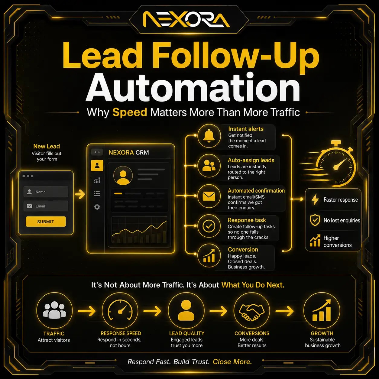
CRM automation does not change the hero design directly, but it improves what happens after the visitor takes action.
If your above-the-fold CTA gets clicks but leads are not followed up quickly, conversions still suffer.
CRM automation can help:
- Capture form leads
- Tag lead source
- Tag service interest
- Notify the team
- Send confirmation email
- Create follow-up tasks
- Track lead status
- Connect chatbot leads
- Track booked calls
- Measure CTA performance
For example, a visitor clicks “Request a Website Review.”
The CRM can tag:
- Source: Website
- Page: Homepage hero
- Interest: Website Development
- Status: New lead
This helps you measure which above-the-fold CTAs actually generate qualified enquiries.
Can AI chatbots improve above-the-fold lead capture?
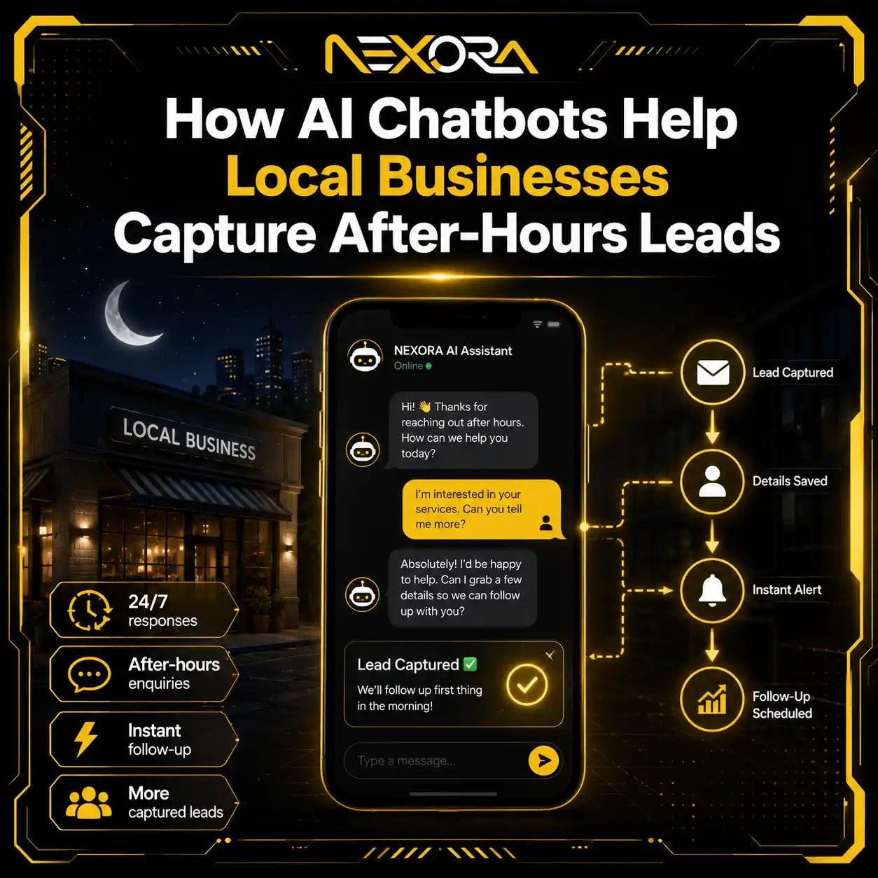
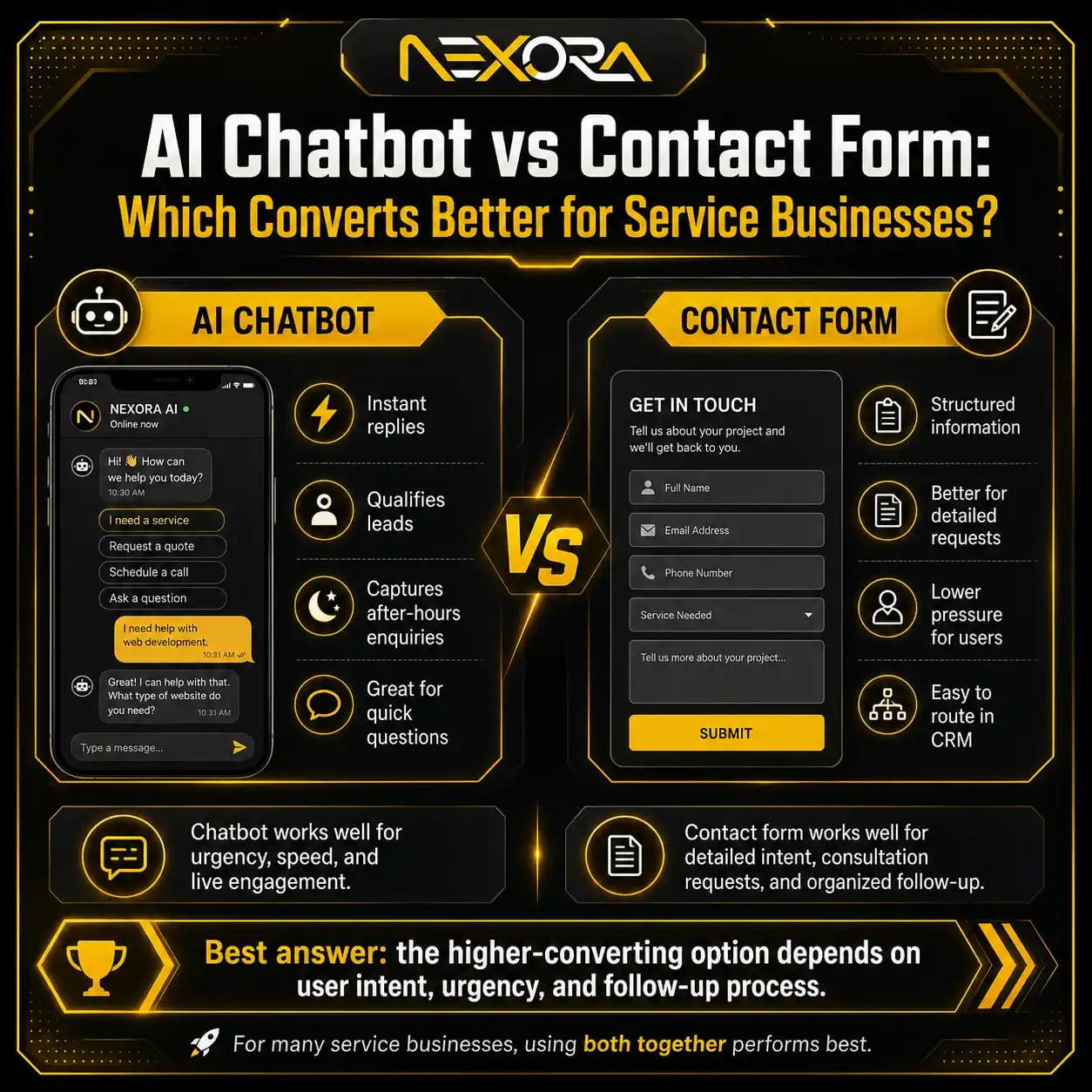
Yes, an AI chatbot can support above-the-fold conversions by giving visitors another low-friction contact option.
Some visitors are not ready to fill out a form.
They may prefer to ask a quick question.
An AI chatbot can ask:
- What service are you interested in?
- Are you trying to improve leads?
- Do you need SEO, website, CRM, or chatbot help?
- What is your website URL?
- Would you like to book a consultation?
- What is the best way to contact you?
It can guide users to:
- Website Development Services
- SEO Services
- CRM Automation Services
- AI Chatbot Services
- Contact page
It can also capture after-hours enquiries.
For service businesses, this can help recover leads that would otherwise leave.
AI Voice Agent & Chatbot Services
How do heatmaps help diagnose above-the-fold issues?
Heatmaps help show whether users interact with the first screen.
They can reveal:
- Users do not click the CTA
- Users scroll immediately without reading
- Users click non-clickable elements
- Users ignore the form
- Users do not reach the form
- Users miss the phone button
- Users get distracted by navigation
- Mobile users abandon early
- Hero image gets attention but CTA does not
Heatmaps help you make better decisions.
Instead of guessing, you can see what users do.
Combine heatmaps with:
- Google Analytics
- Google Search Console
- Form tracking
- CRM data
- Session recordings
- CTA click tracking
This gives a clearer conversion picture.
What should you test above the fold?
Test one change at a time when possible.
Useful tests include:
- New headline
- Shorter hero paragraph
- Stronger CTA text
- CTA position
- Trust badge placement
- Phone number visibility
- Form above the fold
- Button color contrast
- Real image vs stock image
- Hero layout
- Mobile sticky CTA
- Faster hero image
- Different offer
- Chatbot entry message
- Review snippet near CTA
Track:
- CTA clicks
- Form submissions
- Phone clicks
- Chatbot starts
- Service-page visits
- Bounce rate
- Scroll depth
- CRM leads
- Lead quality
Do not only test visual changes.
Test message clarity.
The words often matter more than decoration.
What is the best above-the-fold structure for lead generation?
A strong above-the-fold section for lead generation should include:
- Clear headline
- Short value proposition
- Primary CTA
- Secondary CTA, if useful
- Trust signal
- Relevant visual
- Simple navigation
- Contact option
- Mobile-friendly layout
- Fast loading
Example structure:
What should the headline do?
The headline should explain the service and outcome.
Example:
“Website Development Services Built to Turn Visitors Into Leads”
What should the paragraph do?
The paragraph should explain who you help and how.
Example:
“We help service businesses build fast, SEO-ready websites with clear service pages, strong CTAs, CRM-connected forms, and mobile-friendly lead paths.”
What should the CTA do?
The CTA should offer a specific next step.
Example:
“Request a Website Review”
What should the trust signal do?
The trust signal should reduce hesitation.
Example:
“Trusted by small businesses and local service brands.”
This structure creates clarity fast.
What is the above-the-fold checklist for websites not converting leads?
Use this checklist to review your first screen.
Is the message clear?
Check:
- Headline explains the service
- Paragraph explains the value
- Offer is specific
- Audience is clear
- Problem is clear
- Location is clear, if local
Is the CTA clear?
Check:
- CTA is visible
- CTA is specific
- CTA matches the page intent
- CTA is easy to tap on mobile
- CTA does not compete with too many options
Is trust visible?
Check:
- Reviews
- Testimonials
- Client logos
- Project count
- Response time
- Security or privacy note
- Relevant proof
Is the layout clean?
Check:
- No clutter
- Simple navigation
- Readable text
- Clear spacing
- Strong contrast
- Useful visual
- No distracting slider
Is mobile experience strong?
Check:
- CTA visible quickly
- Hero image not too tall
- Phone button clickable
- Form usable
- Menu works
- Page loads fast
Is lead tracking connected?
Check:
- CTA clicks tracked
- Forms tracked
- Calls tracked
- Chatbot tracked
- CRM connected
- Lead source tagged
If any of these are weak, your website may lose leads before visitors scroll.
How can Nexora Creation help fix above-the-fold issues?
Nexora Creation helps businesses improve above-the-fold sections so websites become clearer, faster, more trustworthy, and more conversion-focused.
For above-the-fold conversion improvements, we can help with:
- Hero section redesign
- Website copy improvement
- CTA strategy
- Service-page structure
- Landing page design
- Mobile UX improvement
- Page speed optimization
- Trust signal placement
- Website development fixes
- SEO intent alignment
- Contact form placement
- CRM lead tracking
- AI chatbot lead capture
- Heatmap-based recommendations
- Conversion-focused website audits
The goal is not only to make the first screen look better.
The goal is to make visitors understand the offer faster and take action with more confidence.
If your website gets traffic but does not convert leads, the above-the-fold section is one of the first places to audit.
What is the best strategy to fix above-the-fold conversion issues?
The best strategy is to improve clarity, trust, speed, and action.
Use this process:
- Review the headline.
- Clarify the offer.
- Shorten the hero paragraph.
- Make the CTA specific.
- Add trust proof.
- Simplify navigation.
- Improve mobile layout.
- Remove clutter.
- Replace generic visuals.
- Add click-to-call or chatbot option.
- Improve hero load speed.
- Match SEO or ad intent.
- Track CTA clicks and leads.
- Connect forms to CRM.
- Test one improvement at a time.
Do not redesign the entire website before fixing the first screen.
Above the fold is where many visitors decide whether to stay or leave.
Conclusion
If your website is not converting leads, your above-the-fold section may be the problem.
Visitors need clarity fast.
They need to know:
- What you offer
- Who you help
- What problem you solve
- Why they should trust you
- What action to take next
Common above-the-fold problems include:
- Weak headline
- Generic value proposition
- Hidden CTA
- Too much clutter
- No trust proof
- Poor mobile layout
- Slow hero section
- Confusing navigation
- Generic stock image
- No contact option
- No clear lead path
- Search intent mismatch
Fixing above-the-fold issues can improve CTA clicks, form submissions, phone calls, chatbot leads, and service-page engagement.
A strong first screen does not need to be complicated.
It needs to be clear, trustworthy, fast, and action-focused.
When visitors understand your offer quickly and feel confident about the next step, your website has a much better chance of turning traffic into qualified leads.
FAQs
What does above the fold mean on a website?
Above the fold means the part of a webpage visitors see before scrolling. It usually includes the header, headline, hero text, CTA, trust signal, and main visual.
Why is above-the-fold content important for lead generation?
It creates the first impression and helps visitors decide whether the page is relevant, trustworthy, and worth taking action on.
What should be above the fold on a service website?
A service website should show a clear headline, short value proposition, CTA button, trust signal, contact option, and relevant visual above the fold.
Why is my website getting traffic but no leads?
Your website may have weak above-the-fold messaging, unclear CTAs, poor trust signals, bad mobile UX, slow loading, weak service pages, or poor lead tracking.
What is a good above-the-fold CTA?
A good CTA is specific and action-focused, such as Request a Website Review, Schedule an SEO Consultation, Request a Quote, or Book a Strategy Call.
Should I put a form above the fold?
For quote pages, booking pages, and paid landing pages, a short form above the fold can help. For service pages, a clear CTA button may work better if users need more trust first.
How can I make my hero headline better?
Make it specific. Include the service, audience, and outcome. Avoid vague headlines like “Grow Your Business Online.”
Should I show reviews above the fold?
Yes, one short review, rating, or trust signal above the fold can reduce hesitation and improve confidence.
Can mobile layout affect above-the-fold conversions?
Yes. If the CTA is hidden, the image is too tall, text is hard to read, or the page loads slowly on mobile, leads can drop.
Can AI chatbots help above-the-fold conversions?
Yes. A chatbot can answer quick questions, guide visitors to the right service, and capture leads from users who are not ready to fill out a form.
How do I know if above-the-fold issues are hurting conversions?
Use heatmaps, session recordings, CTA click tracking, form analytics, scroll depth, CRM data, and mobile testing.
What is the biggest above-the-fold mistake?
The biggest mistake is using a vague headline and hidden CTA. Visitors should immediately understand what you offer and what to do next.