
Website visitors are not filling out contact forms because something on the page is creating friction, confusion, doubt, or lack of urgency before they take action.
A contact form should feel like an easy next step.
But many websites make it feel risky, unclear, long, or unnecessary.
Visitors may leave without submitting because:
- The offer is unclear
- The CTA is weak
- The form asks too much
- The page has no trust proof
- The service is not explained well
- The visitor does not know what happens next
- The form looks difficult on mobile
- The page loads slowly
- The contact form is hidden
- The button text is generic
- The website feels outdated
- There are no reviews or testimonials
- The form has technical errors
- The visitor prefers calling or chatting
- The business does not show response time
- The page does not match search intent
- The form is not connected to CRM or follow-up
As an SEO expert and website developer, I do not treat contact form problems as only design problems.
A contact form issue can come from SEO intent, page structure, UX, copywriting, trust signals, form design, tracking, or follow-up systems.
At Nexora Creation, we look at the full path before the form. The question is not only “Why is the form not converting?” The real question is “Why does the visitor not feel ready, safe, or motivated to submit?”
In this guide, I will explain why website visitors are not filling out contact forms and how to fix the problems that stop leads from coming through.
Why do website visitors avoid contact forms?
Website visitors avoid contact forms when they do not feel enough value, trust, clarity, or convenience.
A visitor may ask:
- What happens after I submit?
- Will someone call me?
- Will I get spammed?
- Is this company trustworthy?
- Is this service right for me?
- How much will this cost?
- How long will it take?
- Do they serve my area?
- Is my problem too small?
- Will they respond quickly?
- Can I just call instead?
- Is the form worth my time?
If the page does not answer these questions, the visitor may leave.
A contact form is usually the final step.
The page must build enough confidence before that step.
Is the contact form too long?
A long contact form can stop visitors from submitting.
This is especially true on mobile.
Visitors may abandon forms that ask for too much information too early.
Common unnecessary fields include:
- Full company details
- Full address
- Budget range
- Project timeline
- Too many dropdowns
- Long message box
- Multiple required fields
- File uploads
- Detailed service questions
- Repeated information
- Account creation
A good contact form should only ask for what is needed to start the conversation.
For many service businesses, a simple form can include:
- Name
- Phone
- Service needed
- Website URL, if relevant
- Short message
For higher-quality leads, you can add one or two qualifying fields, but do not overload the form.
A form should feel easy.
Not like homework.
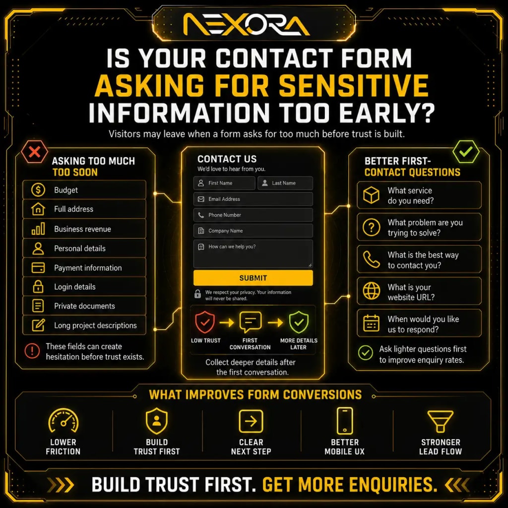
Is your contact form asking for sensitive information too early?
Visitors may avoid forms when they feel the website is asking for too much too soon.
Sensitive fields can include:
- Budget
- Full address
- Business revenue
- Personal details
- Payment information
- Login details
- Private documents
- Long project descriptions
Some users may not be ready to share this information before trust is built.
Instead of forcing sensitive details, ask lighter questions first.
Better early-stage fields include:
- What service do you need?
- What problem are you trying to solve?
- What is the best way to contact you?
- What is your website URL?
- When would you like us to respond?
You can collect deeper details after the first conversation.
Is the CTA too weak or generic?
A weak CTA can reduce contact form submissions.
Generic CTA text does not explain the value of submitting the form.
Weak CTAs include:
- Submit
- Send
- Contact Us
- Learn More
- Get Started
- Click Here
Better CTAs are specific and outcome-focused.
Examples:
- Request a Website Review
- Schedule a Free Consultation
- Get an SEO Audit
- Request a Quote
- Fix My Lead Flow
- Improve My Website Conversion
- Book a Strategy Call
- Ask About CRM Automation
- Add AI Chatbot Lead Capture
A strong CTA tells the visitor what they are getting.
The button should not feel like a technical action.
It should feel like a useful next step.
Is your contact form hidden too far down the page?
Some visitors do not fill out the form because they never find it.
This happens when the form is:
- Only in the footer
- Only on the contact page
- Hidden behind a small link
- Placed after too much content
- Not visible on mobile
- Buried below large images
- Missing from service pages
- Missing from landing pages
- Not linked from blog CTAs
Important pages should make the next step obvious.
Good form placement includes:
- Hero section CTA button
- Mid-page CTA
- After benefits section
- After process section
- Near testimonials
- Final CTA section
- Contact page
- Sticky mobile CTA, if useful
You do not always need the full form above the fold.
But the path to the form should be clear.
Does the page explain what happens after submission?
Visitors hesitate when they do not know what happens next.
A contact form should explain the next step clearly.
Add short text near the form such as:
- “We usually respond within 24 hours.”
- “Tell us about your project and our team will review it.”
- “After you submit, we will contact you to schedule a consultation.”
- “No spam. We only use your details to respond to your enquiry.”
- “Share your website URL and we will review the main issue before replying.”
This reduces uncertainty.
A visitor is more likely to submit when they know what to expect.
Is there enough trust before the form?
Trust is one of the biggest reasons visitors do not submit contact forms.
A visitor may like the service but still hesitate if the website lacks proof.
Trust signals can include:
- Reviews
- Testimonials
- Case studies
- Portfolio examples
- Before-and-after results
- Client logos
- Certifications
- Clear business information
- Team details
- Process explanation
- Security/privacy text
- Real contact information
- Social proof
- Clear service details
Place trust signals near the form.
Do not make users scroll far away to find proof.
A form next to reviews often feels safer than a form alone.
Is your service page too vague?
Visitors do not fill out forms when they do not fully understand the service.
A vague page creates doubt.
Weak copy may say:
“We provide high-quality digital solutions for your business growth.”
This does not explain much.
Better copy explains:
- What you do
- Who you help
- What problem you solve
- What is included
- How the process works
- What result the visitor can expect
- What the next step is
For example:
“Our Website Development Services help service businesses build fast, mobile-friendly, SEO-ready websites that explain services clearly, improve trust, and turn visitors into enquiries.”
Clear service copy creates confidence.
Confidence increases form submissions.
Does your page match the visitor’s search intent?
A visitor may not fill out the contact form if the page does not match what they expected from Google.
For example, if someone searches “SEO services for small businesses,” they expect:
- SEO service details
- Process
- Pricing guidance or consultation path
- Proof
- FAQs
- Clear CTA
If they land on a generic blog or homepage, they may leave.
Search intent problems happen when:
- Ads send users to the wrong page
- SEO traffic lands on weak pages
- Blog pages do not link to services
- Service pages are too broad
- Local visitors land on non-local pages
- Problem-aware visitors do not see a solution
Every page should match the user’s intent.
If the intent is service-related, the page should guide users toward enquiry.
Are visitors coming from the wrong traffic source?
Sometimes the form is not the problem.
The traffic is the problem.
Visitors may not submit forms if they are not the right audience.
Low-quality traffic may come from:
- Broad informational keywords
- Irrelevant blog topics
- Poor ad targeting
- Wrong location targeting
- Social traffic with low intent
- Bot traffic
- International traffic for local services
- Misleading titles
- Wrong landing page
- Unqualified audience
Check traffic quality before redesigning the form.
Look at:
- Landing pages
- Search queries
- Countries
- Devices
- Referral sources
- Ad campaigns
- Engagement
- Service-page visits
- Lead quality
A form cannot convert visitors who are not looking for your service.
Is the website design hurting form submissions?
Website design affects trust and action.
Visitors may avoid forms if the site feels outdated, cluttered, or confusing.
Design problems include:
- Poor layout
- Small text
- Low contrast
- Unclear hierarchy
- Too many distractions
- Unprofessional visuals
- Broken spacing
- Weak buttons
- Poor mobile design
- Outdated branding
- Hidden contact options
- No visual flow
- Too many popups
- No clear path
A conversion-focused website should guide attention.
The page should make it easy to understand:
- What the business offers
- Why it matters
- Why users should trust it
- What action to take
If the design creates confusion, the form will suffer.
Is mobile UX stopping users from submitting?
Mobile UX is a major reason contact forms do not get submissions.
Mobile visitors may abandon forms because:
- Fields are too small
- Button is hard to tap
- Keyboard covers fields
- Form is too long
- Dropdowns are difficult
- Page loads slowly
- Popups block the form
- Error messages are unclear
- Form does not fit the screen
- CTA is hard to find
- Phone number is not clickable
- Form refreshes after error
- Auto-fill does not work
Test your contact form on a real phone.
Do not only check desktop.
A form that works on desktop may fail on mobile.
Mobile users want speed and simplicity.
Is your page loading too slowly?
Slow pages reduce form submissions.
If the page takes too long to load, visitors may leave before seeing the form.
Slow loading can come from:
- Large images
- Heavy videos
- Too many scripts
- Poor hosting
- Page builder bloat
- Unoptimized fonts
- Too many plugins
- No caching
- Render-blocking CSS
- Third-party tracking scripts
- Large background images
- Slow form plugins
A slow contact form can also fail after submission.
This creates frustration.
Improve speed by:
- Compressing images
- Removing unused scripts
- Using caching
- Improving hosting
- Optimizing fonts
- Reducing heavy animations
- Testing mobile performance
- Simplifying page sections
Page speed affects both trust and conversions.
Is the form technically broken?
Sometimes visitors are trying to submit the form, but the form is broken.
Common form issues include:
- Submit button does not work
- Error message appears incorrectly
- Required fields malfunction
- Form does not send emails
- CAPTCHA blocks real users
- Form refreshes and clears data
- Mobile submission fails
- Thank-you message does not appear
- Confirmation email fails
- Leads go to spam
- CRM integration breaks
- Tracking events do not fire
- Form plugin conflict
- JavaScript error
- Server email issue
Test the form regularly.
Submit test leads from:
- Desktop
- Mobile
- Different browsers
- Different devices
- Different email addresses
A broken form can make your website look like it has no demand when the real issue is technical.
Is CAPTCHA reducing form submissions?
CAPTCHA can reduce spam, but it can also block real users.
CAPTCHA problems include:
- Too difficult to complete
- Not loading properly
- Blocking mobile users
- Failing in certain browsers
- Not accessible
- Requiring multiple attempts
- Timing out
- Confusing users
Use spam protection carefully.
Options include:
- Invisible CAPTCHA
- Honeypot field
- Server-side spam filtering
- Better form validation
- CRM spam tagging
- Email verification
- Moderated lead review
The goal is to block spam without blocking real leads.
Are visitors unsure about pricing?
Pricing uncertainty can stop form submissions.
Users may hesitate if they think:
- The service may be too expensive
- The business may not fit their budget
- They will be pressured into a sales call
- There is no starting point
- They do not know what affects cost
You do not always need to show exact prices.
But you can reduce uncertainty with pricing guidance.
Examples:
- “Pricing depends on project scope, pages, features, and integrations.”
- “We provide custom quotes after reviewing your website and goals.”
- “For small businesses, we recommend starting with a focused website review or SEO audit.”
- “During the consultation, we explain the best option based on your current situation.”
Pricing clarity builds confidence.
Confusion creates hesitation.
Are visitors unsure whether you serve their area?
Local service businesses often lose form submissions when location is unclear.
Visitors may wonder:
- Do they serve my city?
- Do they work with businesses in my area?
- Are they local?
- Can they come onsite?
- Do they offer remote service?
- Do they support my region?
Add location clarity with:
- Areas served section
- City-specific pages
- Local phone number
- Google Business Profile link
- Map, if useful
- Local reviews
- Local FAQs
- Service area text
- Contact page location details
If visitors are unsure whether you serve them, they may leave without submitting.
Are visitors unsure whether the service fits them?
A visitor may avoid the form if they are not sure the service is right for their situation.
Add a “Who This Is For” section.
Examples:
This service is a good fit for businesses that:
- Need more qualified leads
- Have a website that does not convert
- Get traffic but no enquiries
- Need better SEO visibility
- Want to automate lead follow-up
- Need a faster website
- Want a clearer service-page structure
- Need AI chatbot lead capture
- Want better CRM tracking
You can also add a “This may not be for you” section if useful.
Clear fit improves lead quality.
Is there no alternative to the contact form?
Not every visitor wants to fill out a form.
Some prefer:
- Phone call
- Live chat
- AI chatbot
- Booking calendar
- Quote request
- Consultation button
- Messenger
- SMS
If your website only offers a form, you may lose visitors who prefer another contact method.
Add alternatives such as:
- Click-to-call button
- Chatbot
- Booking link
- Direct email
- WhatsApp button, if appropriate
- Short quote form
- Consultation CTA
Different users prefer different contact paths.
Give them options without making the page confusing.
Can an AI chatbot increase contact form conversions?
Yes, an AI chatbot can increase conversions by helping visitors who are not ready to submit the form.
A chatbot can ask:
- What service are you interested in?
- What problem are you trying to solve?
- Do you need SEO, website, CRM, or chatbot help?
- What is your website URL?
- What is your preferred contact method?
- Do you want a consultation?
It can answer:
- What happens after I submit?
- Do you work with small businesses?
- How does the process work?
- Can you review my website?
- Can I request a quote?
It can also guide users to the correct page or form.
AI chatbots are helpful for after-hours visitors, hesitant visitors, and users who need quick clarification.
AI Voice Agent & Chatbot Services
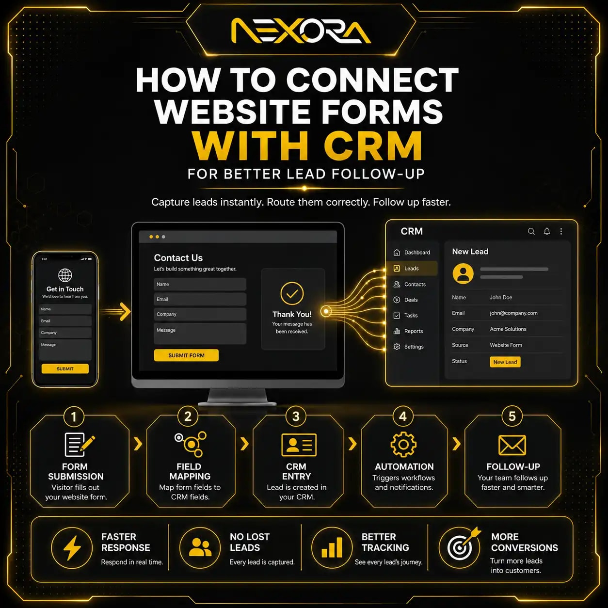
Is your form connected to CRM?
A contact form is only useful if the lead reaches the right place.
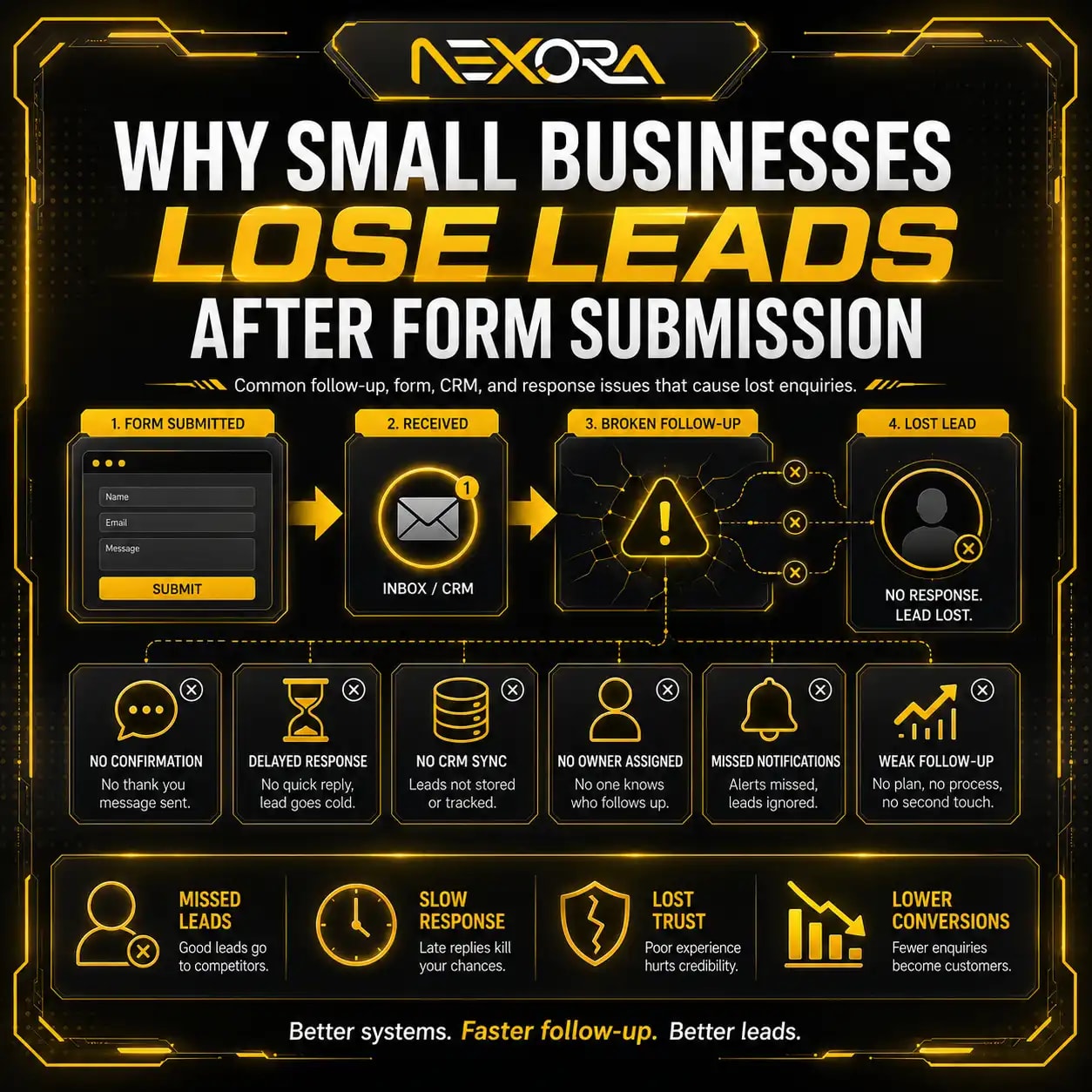
Many businesses lose leads after the form submission.
Problems include:
- Lead emails go to spam
- No one responds quickly
- Leads are not assigned
- No follow-up reminder
- No lead source tracking
- No service interest tag
- No pipeline stage
- No automatic confirmation
- No CRM record
- No call task
- No reporting
A CRM-connected form can:
- Create a lead automatically
- Tag the source page
- Tag service interest
- Notify the team
- Send confirmation email
- Start follow-up workflow
- Track lead status
- Show which pages generate enquiries
If visitors submit forms but leads are not handled properly, revenue can still be lost.
Are you tracking form submissions correctly?
Sometimes contact forms are working, but tracking is broken.
You may think visitors are not submitting when analytics is not recording the event.
Check:
- GA4 events
- Google Tag Manager
- Thank-you page tracking
- Form submit triggers
- CRM records
- Email notifications
- Call tracking
- Chatbot leads
- Conversion pixels
- Spam filtering
- Duplicate tracking
- Consent banner impact
Tracking problems can create false conclusions.
Compare:
- Form plugin entries
- CRM leads
- Email inbox
- GA4 conversions
- Google Ads conversions
- Tag Manager preview
- Server logs
If these do not match, fix tracking before making conversion decisions.
Are visitors abandoning the form halfway?
Form abandonment happens when users start filling the form but leave before submitting.
Common causes include:
- Too many required fields
- Confusing fields
- Error messages
- CAPTCHA
- Slow form submission
- Privacy concerns
- Budget field hesitation
- Required phone number
- Long message requirement
- File upload requirement
- No progress indicator
- Mobile issues
Use form analytics or session recordings to see where users stop.
Then simplify the form.
Possible fixes:
- Reduce required fields
- Make phone optional
- Make message optional
- Use clearer labels
- Add trust text
- Improve error messages
- Remove difficult CAPTCHA
- Improve mobile layout
- Use multi-step form carefully
A form should feel easy to complete.
How do testimonials near forms improve submissions?
Testimonials near forms reduce anxiety.
They remind users that other people trusted the business.
Place short testimonials near:
- Contact form
- Quote form
- Booking CTA
- Final CTA
- Service-page form
Use testimonials that mention the service.
Example:
“Nexora Creation helped us rebuild our website structure and connect our forms to CRM. We now know where leads come from and follow up faster.”
This type of testimonial supports the form action.
It makes the visitor more comfortable submitting.
How does privacy messaging affect contact forms?
Visitors may avoid forms if they worry about spam or privacy.
Add short privacy reassurance near the form.
Examples:
- “We only use your details to respond to your enquiry.”
- “No spam. Your information stays private.”
- “Your message goes directly to our team.”
- “We will not share your information.”
- “We usually respond within one business day.”
Keep it short.
Do not add a long legal paragraph near the form.
The goal is to reduce hesitation.
How do forms on service pages differ from contact page forms?
Service-page forms should match the specific service.
Contact page forms can be more general.
For example, a Website Development service form can ask:
- Do you need a new website or redesign?
- What is your current website URL?
- What is your main website problem?
An SEO service form can ask:
- Are your rankings dropping?
- What is your website URL?
- What SEO issue are you facing?
A CRM Automation form can ask:
- Where do your leads currently go?
- What CRM do you use?
- What follow-up issue are you facing?
Service-specific forms can improve lead quality.
But keep them short.
How do blog pages support contact form submissions?
Blogs can support contact form submissions by guiding users from problem-aware content to service pages or contact options.
For example:
A blog about “website not generating leads” can guide users to:
- Website Development Services
- CRM Automation Services
- AI Chatbot Services
- Contact Us
A blog about “rankings dropping” can guide users to:
- SEO Services
- Website Development Services
- Contact Us
A blog about “missed calls” can guide users to:
- AI Voice Agent Services
- CRM Automation Services
- Contact Us
Blogs should include:
- Relevant internal links
- CTA blocks
- Service connection
- Contact path
- FAQs
- Trust signals
Traffic without a lead path is wasted opportunity.
How can heatmaps and recordings help diagnose form problems?
Heatmaps and session recordings show how users interact with the page.
They can reveal:
- Users not scrolling to the form
- Users clicking non-clickable elements
- Users abandoning form fields
- Users missing CTA buttons
- Users struggling on mobile
- Users closing popups
- Users ignoring sections
- Users getting confused by layout
Use these insights to improve:
- CTA placement
- Form position
- Button design
- Page layout
- Section order
- Mobile usability
- Form length
- Trust signal placement
Analytics tells you what happened.
Recordings can show why it happened.
What should you test to improve contact form submissions?
Test one thing at a time.
Useful tests include:
- Shorter form
- Different CTA button text
- Form higher on the page
- Trust text near form
- Testimonial near form
- Click-to-call button
- Chatbot option
- Better headline
- Service-specific form
- Fewer required fields
- Optional phone number
- Better mobile layout
- Faster page loading
- Different offer
- Consultation CTA instead of generic contact CTA
Do not test everything at once.
Track before and after results.
Use data to decide what worked.
What is the best contact form structure for service businesses?
A good contact form for service businesses should be simple, clear, and connected to follow-up.
Recommended fields:
- Name
- Phone
- Service needed
- Website URL, if relevant
- Short message
Optional fields:
- Preferred contact method
- Preferred contact time
- Project timeline
- Business type
Avoid making too many fields required.
Use a strong button:
- Request a Consultation
- Get My Website Reviewed
- Request a Quote
- Send My Enquiry
- Book a Strategy Call
Add reassurance:
- Response time
- Privacy note
- What happens next
Connect the form to CRM.
Track submissions.
Test it regularly.
What is the full checklist to fix low contact form submissions?
Use this checklist to diagnose and fix contact form problems.
How do you check the form itself?
Check:
- Form works on desktop
- Form works on mobile
- Submit button works
- Required fields work
- Error messages are clear
- CAPTCHA does not block users
- Confirmation message appears
- Lead email is received
- CRM receives the lead
- Tracking fires correctly
How do you check form friction?
Check:
- Number of fields
- Required fields
- Sensitive questions
- Long message box
- Budget field
- File upload
- Dropdown complexity
- Mobile usability
- Auto-fill support
How do you check trust?
Check:
- Reviews
- Testimonials
- Case studies
- Portfolio
- Privacy note
- Response time
- Clear contact details
- Business identity
- Process explanation
How do you check page clarity?
Check:
- Headline
- Service explanation
- Benefits
- Process
- Pricing guidance
- FAQs
- Location clarity
- Who the service is for
- CTA wording
How do you check traffic quality?
Check:
- Landing pages
- Search queries
- Ad campaigns
- Countries
- Devices
- Referral sources
- Engagement
- Service-page visits
- Lead quality
How do you check tracking?
Check:
- GA4 events
- Tag Manager
- CRM records
- Form plugin entries
- Email notifications
- Google Ads conversions
- Call tracking
- Chatbot leads
This checklist helps you fix the real issue instead of guessing.
How can Nexora Creation help improve contact form conversions?
Nexora Creation helps businesses improve contact form submissions by reviewing the full conversion path, not only the form design.
For contact form conversion improvement, we can help with:
- Website UX review
- Service-page structure
- Contact form redesign
- CTA improvements
- Trust signal placement
- Mobile form optimization
- Page speed improvement
- Landing page optimization
- SEO intent review
- Internal linking
- CRM integration
- Form tracking setup
- AI chatbot lead capture
- Conversion tracking
- Website development fixes
- Lead follow-up automation
The goal is not only to get more form submissions.
The goal is to get more qualified enquiries and make sure they are tracked, followed up, and connected to the right service.
If your website gets visitors but few contact form submissions, the problem may be page clarity, trust, UX, form friction, traffic quality, or lead tracking.
What is the best strategy to increase contact form submissions?
The best strategy is to reduce friction, increase trust, improve clarity, and make follow-up trackable.
Use this process:
- Confirm the form works.
- Test mobile submission.
- Reduce unnecessary fields.
- Improve CTA button text.
- Add trust signals near the form.
- Explain what happens after submission.
- Add privacy reassurance.
- Make service pages clearer.
- Match pages to search intent.
- Add alternative contact options.
- Improve page speed.
- Track form submissions.
- Connect forms to CRM.
- Add chatbot support where useful.
- Monitor lead quality.
Do not only change the button color.
Most form conversion problems are deeper than design.
A visitor submits when the page gives them enough reason and enough confidence to act.
Conclusion
Website visitors are not filling out contact forms because something is stopping them before they take action.
The issue may be:
- Form length
- Weak CTA
- Poor trust
- Vague service copy
- Bad mobile UX
- Slow page speed
- Broken form
- CAPTCHA friction
- Pricing uncertainty
- Location confusion
- Weak traffic quality
- No CRM follow-up
- Poor tracking
- No alternative contact method
A contact form is not isolated.
It depends on the entire page experience.
To improve form submissions, make the page clearer, the form easier, the CTA stronger, the trust signals more visible, and the follow-up system more reliable.
The goal is not only more submissions.
The goal is more qualified leads that your business can actually track, respond to, and convert.
FAQs
Why are visitors not filling out my contact form?
Visitors may not fill out your contact form because it is too long, unclear, hidden, untrustworthy, hard to use on mobile, technically broken, or not matched to their intent.
How many fields should a contact form have?
Most service business contact forms should start with 4 to 6 fields, such as name, email, phone, service needed, website URL if relevant, and a short message.
Should phone number be required on a contact form?
It depends on lead quality needs. Making phone number optional can increase submissions, while requiring it may improve lead quality but reduce volume.
What CTA works best for contact forms?
Specific CTAs usually work better than “Submit.” Examples include Request a Quote, Schedule a Consultation, Get a Website Review, and Book a Strategy Call.
Can mobile UX reduce contact form submissions?
Yes. Small fields, slow loading, difficult dropdowns, hidden buttons, popups, and poor layout can stop mobile users from submitting forms.
How do I know if my contact form is broken?
Submit test leads from desktop and mobile, check email delivery, CRM records, confirmation messages, GA4 events, and form plugin entries.
Can trust signals improve form conversions?
Yes. Reviews, testimonials, case studies, privacy notes, response time, and clear contact details can reduce hesitation and improve submissions.
Should I add a chatbot instead of a contact form?
A chatbot should support the contact form, not always replace it. It can answer questions, qualify visitors, capture leads, and guide users to the right service.
Why do people start filling out forms but not submit?
They may abandon the form because of too many fields, confusing questions, required phone numbers, CAPTCHA issues, privacy concerns, or mobile usability problems.
How does CRM help contact form leads?
CRM helps capture leads, tag the source page, assign follow-up tasks, send notifications, track status, and measure which pages generate qualified enquiries.
Can SEO traffic affect form submissions?
Yes. If your traffic comes from low-intent or irrelevant queries, visitors may not submit forms even if the page design is good.
What is the biggest contact form mistake?
The biggest mistake is treating the form as the only problem. Contact form conversion depends on page clarity, trust, UX, traffic quality, CTA, tracking, and follow-up.